Assignment Background
Posters are particularly important in my classes that emphasize digital and multimodal communication: students combine their skills in visual, written, digital, and even oral communication. Generally, I assign posters as a way for students to use theory or research to interpret a text. They work well to help students think about organization in concrete, specific ways. Below, you will find the process that I have students follow to create a poster in InDesign; I use this assignment as a stepping stone to more complex assignments that require the use of the software (such as the book design assignment). However, in other classes that do not require such advanced software, I teach students to design the posters using PowerPoint or online design packages such as PiktoChart, Venngage, or Canva.
This version of the assignment is from my course, "The Science, Technology, and Art of Reading," where students study book history in terms of neuroscience, graphic design, philosophy, history, and literature. This assignment occurs after students have learned some basic neuroscience concepts, and are now starting to study graphic design and typology alongside philosophical theories of language.
This version of the assignment is from my course, "The Science, Technology, and Art of Reading," where students study book history in terms of neuroscience, graphic design, philosophy, history, and literature. This assignment occurs after students have learned some basic neuroscience concepts, and are now starting to study graphic design and typology alongside philosophical theories of language.
Prompt |
Objectives |
|
In class, we will be discussing the ways in which books are a technology; as a starting point, we will use the work of Clark and Chalmers on how technology (including language) can be a way of “extending the mind.” We will also be examining how typography and layout work to help readers use the technology of the book. We will be discussing how visual design and layout of books combine with written and visual content to make books tools for those who read them. Your task is to create a 36 x 24 inch poster that describes and analyzes the visual design of one of your textbooks (or another informative book with interesting visual design, provided you get pre-approval from Dr. Taylor) using Clark and Chalmer’s theory of the extended mind, William Sherman’s information about marginalia, and/or Ellen Lupton’s arguments about typography. Generally speaking, this poster should provide the bare bones of evidence and claims to support your argument. In the accompanying oral artist’s statement (5-6 minutes, in the form of a Prezi with voice-over), you will expand that argument through analysis as well as provide a justification your own design choices.
|
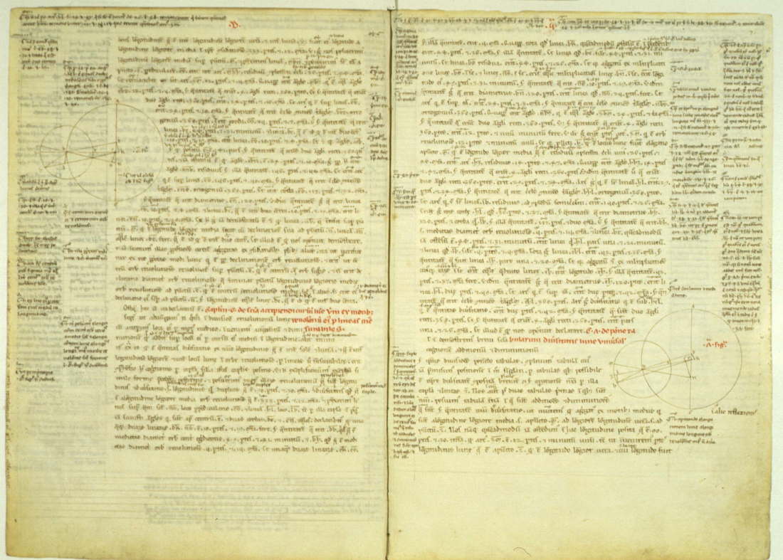
Ptolemy’s Almagest. In Latin, translated by Gerard of Cremona, thirteenth century. Vat. lat. 2057 fols. 70 verso-71 recto, fols. 146 verso - 147 recto math11a NS.10. Source: Greek Mathematics.
|
Process
Step 1: Choose a textbook. Choose one of your textbooks for another class (or another informative book) that you think would be interesting to write about in relationship to Clark and Chalmers, Sherman, and/or Lupton. You may use one of the textbooks from this class only if none of your other classes have physical textbooks or you cannot find another interestingly-designed book. If you are unsure if a book is a good choice, bring it to office hours and we can discuss it. Then, choose one visually interesting spread (two facing pages) from your textbook. Go to the library and scan it (must be a high quality scan, at least 300dpi! ), and either e-mail it to yourself, put it on a cloud storage drive, or bring it to class on a flash drive. Write notes to yourself about which elements on the page you think are most interesting/important. We will be working with the scan in class.
Step 2: In-class InDesign Workshop. Come prepared with the scan and your notes; we will walk through how to set up your poster, some of the important tools you will use, and have time for playing with the software you will be using.
Step 3: Create a Logical Outline. For the most part, follow the same directions for this logical outline as you did for your last assignment. Most of the analysis from the outline will end up in your artist’s statement, but your points and evidence will also end up on your poster. Remember to start with a serious, interesting question—in this case, it should have something to do with how the textbook you’ve chosen uses different visual technologies (layout, fonts, etc.) to “extend the mind” of the reader. What does it mean to extend the mind through visual technologies? Put your own spin on this question. Get stuck? Try conducting a rhetorical analysis of your textbook: identify the audience, purpose, context, genre, and important design choices that make up how the text functions. In what ways are the design choices tailored to the rhetorical purpose? Do they achieve that purpose, and why or why not?
|
Step 4: Create a Visual Outline. Visual outlines are hand-drawn sketches that lay out possibilities for visually organizing the images and text that you will be including. Often times, creating multiple visual outlines will allow you to better see different possibilities. Use the questions below to identify key questions and concerns.
|
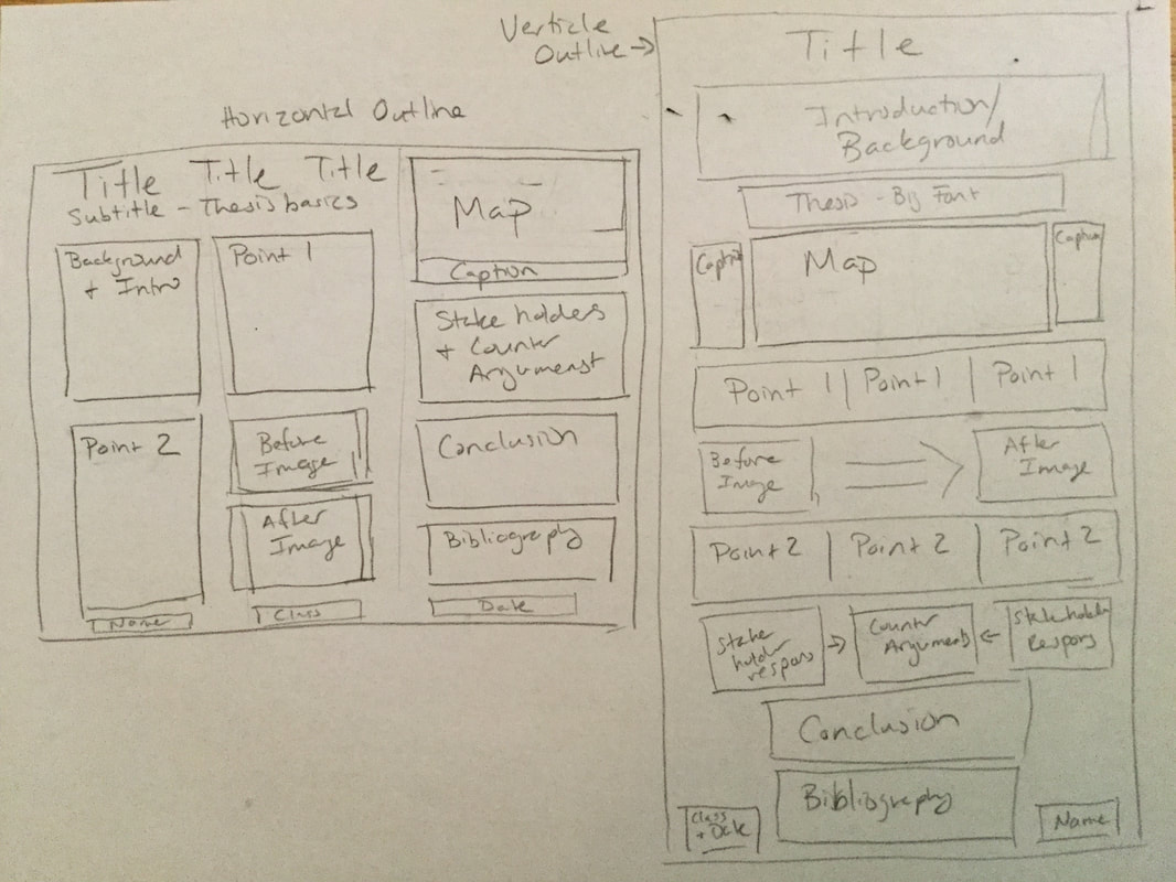
Two sample visual outlines, one horizontal and one vertical. These might not have ideas to scale, but show the general ideas and their relationships to one another.
|
|
Step 5: Rough Draft. Your rough draft should consist of two elements:
|
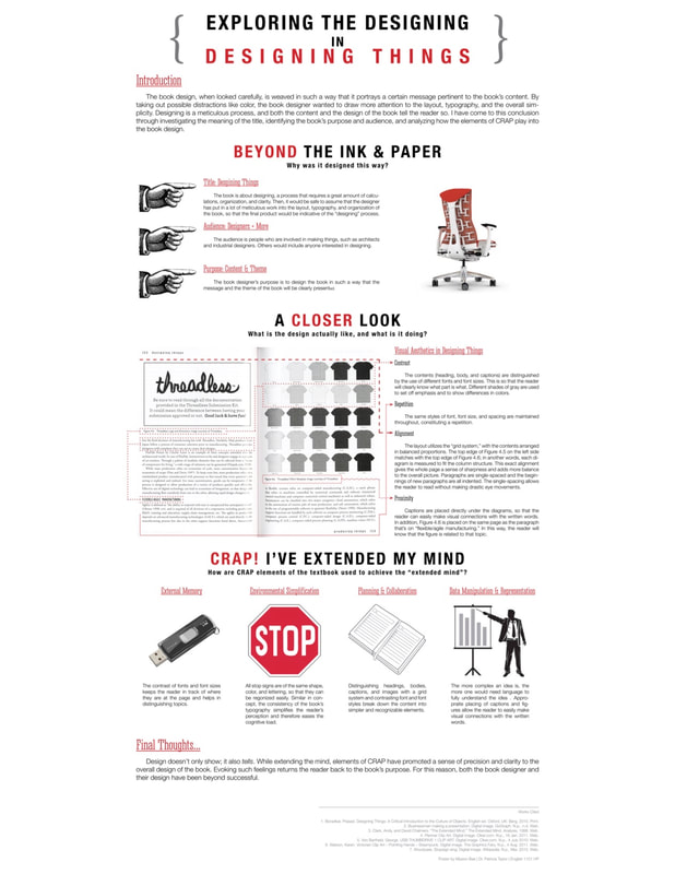
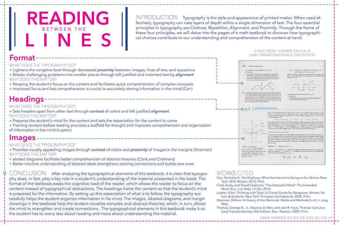
The sample poster to the left was created in 2015 by Miyeon Bae, a first-year student at Georgia Tech majoring in industrial design. Her poster is now featured in Georgia Tech's internal textbook, WOVENText, as an example of excellent poster design.
|
Step 6: Peer Review. Read your assigned posters and artists' statements, and write a letter to each author about their work. Each letter should be about one page, single spaced in length, though length is not as important as quality. Include the following in your letter
- What do you see as the argument of the whole project? How could that argument be more effective? Do the poster and artist’s statement together have a clear “so-what” factor, or can you suggest one?
- Is the evidence in the poster and/or artist’s statement sufficient to prove the argument?
- Howe effective is the visual analysis of the book? Are there any design elements in the book that you can see that the author doesn’t discuss but should? How well does the author explain the theory she or he is using? Are the theory and the design discussions adequately connected?
- How effective is the visual design of the poster? Where could the design be improved? Consider the following elements as a starting point: a) use of space; b) organization and hierarchy; c) color and visual appeal; d) alignment of text and image; e) typography principles from Lupton
- How well does artist’s statement reflect the content of the poster, and vice versa? Are there any elements of the poster that does the artist’s statement not sufficiently explain?
- Is the tone of the artist’s statement appropriate?
Step 7: Create your Prezi. See directions on the handout you will receive in class.
Step 8: Turn in your final draft.
Step 8: Turn in your final draft.